
Design studio · Growth note
Responsive Breakpoints: Choose Them Where Content Fails
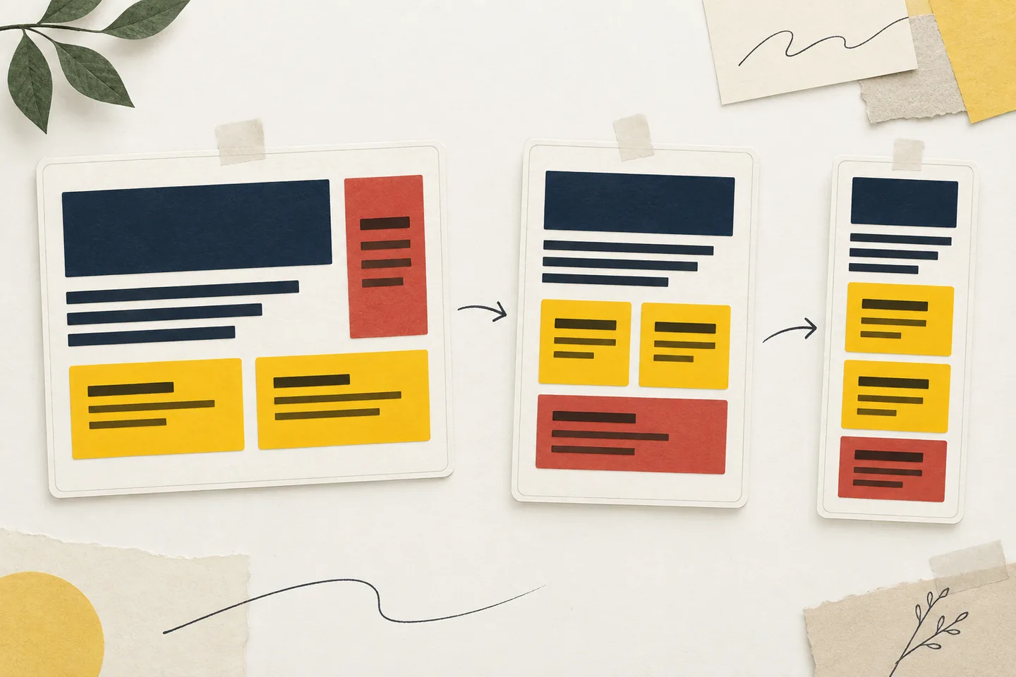
A responsive breakpoint should answer a visible problem. A heading collides with a control, a sidebar squeezes the article, or card labels wrap into cramped stacks. Those are reasons to change the layout. A device name is not. Start with representative content, narrow the available space, and record the first condition the layout cannot handle. MDN’s guide to media queries recommends changing a design where its content starts to break and using responsive browser tools to find that point.
Prepare content that can expose a failure
Consider an article page with a main column and a supporting sidebar. The article contains an introduction and a two-card grid. Each card has a heading, a description, and a text link. The sidebar holds related reading and a short navigation list. This gives you several distinct things to inspect as the page narrows: reading width, card width, link wrapping, and the space taken by supporting material.
Use real copy or deliberately demanding examples. Include a long card heading and the longest likely navigation label. Identical placeholder text can conceal a problem that appears when actual content arrives. Keep supporting links in the document when their position changes. Moving the sidebar below the article changes the layout; removing its links changes what the reader can reach.
Begin at a width where both columns work. Narrow the browser gradually rather than jumping between preset device sizes. Ask whether the article remains comfortable to read, whether card headings wrap without covering links, and whether the sidebar list stays legible. Record what fails and the width at which it happens. That observation gives the next layout rule a reason to exist.
Work from the failure to the rule
Suppose this particular page has 24 CSS pixels of padding on each side, a 24-pixel gap between columns, and a sidebar that needs 240 pixels. Its article column needs at least 520 pixels with the chosen copy and type. The two-column arrangement therefore needs 832 pixels: 48 for outer padding, 24 for the gap, 240 for the sidebar, and 520 for the article. These are example measurements, not universal breakpoints.
At 820 CSS pixels, the article would receive only 508 pixels if those other measurements stayed fixed. The sidebar is taking space the article needs. Switch the page to one column around that failure, placing the supporting material after the main content. Resize just above and below the boundary. If the wider layout fails immediately above it, or the change creates an awkward jump, adjust the design and measure again.
Next inspect the cards in the expanded article column. Suppose each needs 220 pixels of usable width, with a 16-pixel gap. Two cards need 456 pixels in total. At a 480-pixel viewport, the page's 48 pixels of outer padding leave only 432 pixels for content, giving two equal cards 208 pixels each. In this example, the card grid should become one column when its own available width falls below 456 pixels. The sidebar and card changes have different causes, so they need not share a breakpoint.
Match the query to the space being measured
A viewport media query suits the page-level decision: the browser width determines whether the article and sidebar fit together. With a 16-pixel root font size, a minimum width of 52rem corresponds to the example's 832 pixels. The default layout can be one column, with the sidebar column added above that threshold. Treat the number as the result of testing this page's content and spacing; a different type size or sidebar may require a different value.
The cards may appear in a full-width article, beside a sidebar elsewhere, or inside a narrow section. A viewport query cannot tell how much width their wrapper received. A container query can respond to a declared ancestor instead. MDN’s container query guide explains that size queries apply styles to descendants according to the dimensions of their query container.
For the example, the card wrapper could declare its inline size as a query container. The grid could default to one column and switch to two when that container reaches 28.5rem, or 456 pixels at the assumed root size. Its rule then follows the component's space wherever it appears. Before adding either query, try flexible tracks, sensible minimum widths, and normal text wrapping. A breakpoint is useful when the arrangement actually needs to change, such as moving the sidebar or reducing the number of cards per row.
Test beyond the named widths
Drag the responsive viewport slowly across each boundary. Test just above it, at it, and just below it, then stop at several widths between the rules. A page can pass at the endpoints while failing in the middle because a label grows, a long word cannot wrap, or another font changes line lengths. Describe failures so someone else can reproduce them: at 820 CSS pixels, with the longest sidebar label present, the article falls below its tested readable width. That is more useful than calling the view wrong.
Check the page's viewport configuration on narrow screens. Without an appropriate viewport setting, a browser may lay the page out in a wider virtual viewport and shrink it, making narrow media queries behave unexpectedly. MDN’s viewport documentation explains this behaviour and the commonly used width=device-width setting. That setting makes the width test meaningful; it cannot rescue a cramped layout.
Check reflow and enlarged text
After the breakpoint sequence works, narrow the content to 320 CSS pixels and inspect the full page. The W3C’s explanation of WCAG’s Reflow criterion says vertically scrolling content should remain available without loss of information or functionality and, except where two-dimensional layout is needed for meaning, without scrolling in two dimensions at a width equivalent to 320 CSS pixels. It also relates that width to a 1280-pixel starting viewport at four times magnification.
Read a paragraph without horizontal panning and follow a long card link to its end. Confirm that related links remain available after the sidebar moves. Look for fixed-width examples, unbroken addresses, or excessive padding that pushes the whole document wider than the viewport. Let text wrap where possible. If one element genuinely needs horizontal space, contain scrolling to that element rather than making the page scroll sideways.
Repeat the inspection with enlarged text. Zoom can reveal problems a narrow preview at default text size misses: navigation may overlap content, a control label may be clipped, or a fixed-height card may cover the next item. Test a long article title and a crowded navigation state as well as a tidy sample. A useful breakpoint keeps information and actions usable as the content and text size change.
Keep navigation operable
Navigation may need to change shape before the rest of the page. Links might wrap, form a compact list, or move behind a clearly labelled menu button. Choose an arrangement that preserves clear destinations and a logical reading order. Essential links should not depend on hover, and visual rearrangement should not leave keyboard focus moving through an unexpected sequence.
Use Tab and Shift+Tab to reach every link and control. If there is a menu, open and close it from the keyboard and check that focus stays visible. W3C’s guidance for the Keyboard criterion states that functionality must be operable through a keyboard interface. A narrow layout has failed if its navigation looks orderly but cannot be used.