
Design studio · Growth note
Web Design Examples: Evaluate Usability Beyond the Screenshot
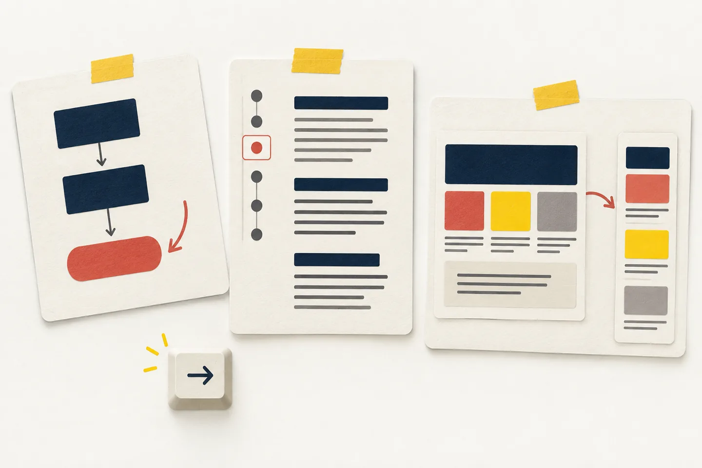
A screenshot can show a page’s colour, spacing and composition. It cannot show whether someone can find the right path, use the navigation with a keyboard or read the page after enlarging it. Useful web design examples deserve a closer inspection: choose a task, follow the content and record what the available evidence does—and does not—show.
The three pages below serve different needs. A GOV.UK page helps someone begin a passport renewal. A Wikipedia article helps someone explore a broad subject. A W3C tutorial helps a practitioner learn about menus. The aim is to compare how each page supports its task, then borrow a useful pattern without copying its appearance.
A rubric for live examples
Give each example a task before judging it. For a service page, ask, “Can I tell whether this is the right process and what to do next?” For a reference article, ask, “Can I reach the section I need?” For a tutorial, ask, “Can I find the lesson and continue through it?” Keep those tasks beside the scores. Otherwise, a page built for careful reading may be penalized for lacking the prominent action a service page needs.
Score task clarity, keyboard navigation, reflow and readable content from 0 to 2, recording the reason beside each score. A 2 for keyboard navigation needs a completed check of focus visibility, order and controls. A visible link path without an interaction test earns at most 1. A 0 may mean no usable evidence was collected rather than that the page failed.
This distinction matters. W3C’s explanation of the Reflow criterion describes content that remains available at a width equivalent to 320 CSS pixels, with exceptions for material that needs a two-dimensional layout. A desktop screenshot cannot establish that result. Likewise, visible links alone cannot establish focus order or keyboard access.
For a repeatable check, start each task from the same entry page. Note the first link or heading you expect a reader to use, then record the route actually taken. If a label is ambiguous, write down the competing choices rather than guessing the designer’s intent. Separate observations about the page from your interpretation: “the next link says Renew” is observable; “every applicant will understand it” would require evidence from users.
Example 1: GOV.UK’s passport renewal page
Task: Decide whether this is the right route for renewing an adult passport and find the next step. On the “Renew or replace your adult passport” overview, the heading names the job directly. The opening text distinguishes adult passports from child applications and points people outside the UK toward a different route. Sections then cover timing, tracking and receiving the passport, followed by a “Next: Renew” link. Those details help a visitor establish where they are before moving forward.
Task clarity: The heading and exception links help someone decide whether to continue. Follow “Next: Renew” before judging the whole journey: the overview alone cannot show whether later steps keep renewal and replacement clear.
Content: Short sections let readers find a concern without reading every paragraph. That fits GOV.UK’s interface-writing guidance: put important words early and use headings that describe what follows. Borrow the order of decisions and supporting information, rather than the government branding.
Example 2: Wikipedia’s “Web design” article
Task: Find an explanation of a particular aspect of web design without reading the entire article. The Wikipedia article has a table of contents with sections including history, tools and technologies, and skills and techniques. Within the skills section, more specific entries point to subjects such as page layout and typography. Search and article links offer other routes when the contents list does not match the reader’s question.
Navigation: The contents list maps a long document, supporting a different journey from GOV.UK’s guided next step. The cost is density: navigation, inline links, references and other controls compete for attention. Add a contents list to your own page only if distinct sections make jumping worthwhile.
Readability: Descriptive headings support scanning, but many inline links can interrupt continuous reading. A smaller editorial site might need only a short contents list and restrained related links. Ask a reader to find a particular answer; if the labels send them to the wrong section, revise the labels or the structure.
Example 3: W3C’s Menus Tutorial
Task: Learn which part of menu design to work on next. The W3C Menus Tutorial opens with links to Structure, Styling, Fly-out Menus and Application Menus. Each label names a distinct problem, and a “Next: Menu Structure” link provides a sequential route. The page serves both a reader following the lessons in order and a practitioner arriving with a specific menu question.
Choice of paths: Readers can choose a topic or follow the sequence. The topic labels say what each lesson covers without repeating the lesson on the landing page. For documentation, precise labels also expose gaps: a recurring question with no clear route may need another entry.
Comparison scores
These are inspection scores for the stated tasks, based on the pages’ available text and links. Keyboard operation and narrow-viewport behaviour were not tested in an interactive browser, so the scores record evidence gaps rather than claiming an accessibility audit.
- GOV.UK overview: task clarity 2/2; keyboard navigation 1/2, link path visible but focus untested; reflow 0/2, narrow view untested; readable content 2/2, sections answer likely questions.
- Wikipedia article: task clarity 2/2; keyboard navigation 1/2, links visible but controls untested; reflow 0/2, narrow view untested; readable content 1/2, useful headings amid dense material.
- W3C tutorial: task clarity 2/2; keyboard navigation 1/2, lesson links visible but focus untested; reflow 0/2, narrow view untested; readable content 2/2, concise labels explain each route.
The matching reflow scores are a limitation of this inspection, not a verdict that the sites behave alike. To finish the comparison, open each page in a browser at a narrow viewport and at increased zoom. Check that text remains readable, essential controls remain available and reading does not require repeated sideways scrolling. Then use Tab and Shift+Tab to follow the chosen task. Record where focus goes, whether it stays visible and whether any menu can be opened and left without a mouse. Update only the scores supported by those observations.
Keep a short record of the browser, viewport and zoom setting. Recheck the precise place where a task stalled after any design change. A score can show where to investigate, but the observation tells a colleague what to fix: a missing focus indicator, an unclear section label or a control pushed outside the narrow view. If the page changes before the follow-up, repeat the task rather than assuming the earlier result still applies.
Borrow the pattern, not the visual shell
From GOV.UK, borrow the sequence of confirming the right route, answering immediate concerns and presenting a next step when your service has comparable decisions. Test the actual path with your own labels and content.
From Wikipedia, borrow section navigation when a document is long enough to need several entry points. From W3C, borrow distinct topic choices and a sequential next step when lessons support both approaches. Check that each label leads to what it promises.
Test the borrowed pattern with a real task and real content. Keep the chosen task, observations and untested conditions beside each score so another reviewer can continue the comparison.