
Design studio · Growth note
Web Design Software: How to Choose the Right Tools for Your Website
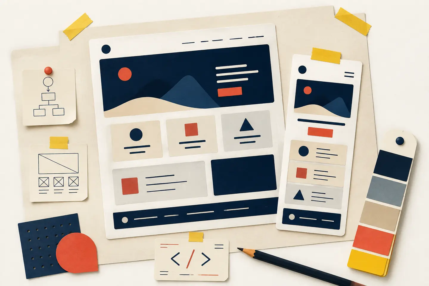
In this guide, “web design software” means the tools used to plan, design, build, test and publish a website. That can include visual website builders, code editors, design and prototyping applications, content management systems, browser developer tools and testing utilities. These categories overlap, but they solve different problems. A small personal site may need one visual builder. A larger project may use several specialised tools working together.
Start with the website, not the software
Before comparing features, define the website’s job. Is it a simple portfolio, a service business site, an online publication, a shop, a membership platform or a web application? The answer affects the kind of software that will be useful.
A brochure-style site usually needs clear pages, a navigation structure, accessible typography, a contact route and a reliable publishing workflow. A publication needs content management, editing workflows and an easy way to create new articles. An online shop needs product management, stock information, checkout and order handling. A web application may require a code-based workflow, data storage, authentication and a more involved testing process.
Write down the essential pages, interactions and content types before opening a software comparison page. Separate requirements into three groups: must have, useful to have and unnecessary for now. This small exercise gives you a way to judge software against the project rather than allowing the software to define the project.
The main types of web design software
Visual website builders
Visual builders let you assemble pages through a graphical interface. You may work with sections, components, text blocks and layout controls while the software handles much of the underlying code and publishing process.
This approach can be a sensible starting point for a small site, especially when the person maintaining it does not want to write code. It can make common tasks—creating pages, changing text and arranging sections—more approachable. Templates can also provide a useful starting structure.
Code editors and development environments
A code editor is designed for working directly with HTML, CSS and JavaScript. HTML gives a page structure and meaning, CSS controls presentation and layout, and JavaScript adds interactivity. These remain the fundamental technologies used to build web pages, as explained in the MDN overview of the web standards model.
The trade-off is responsibility. You must organise the project, check browser behaviour, manage dependencies, test interactions and publish the files through a suitable hosting setup. A code editor does not automatically make a website accessible, responsive or easy to maintain. It simply gives you more direct control over the decisions.
Interface design and prototyping tools
Design and prototyping software sits earlier in the process. It helps you explore page structure, typography, colour, spacing and interaction before the final website is built. A wireframe can answer whether the page hierarchy is clear. A prototype can show how a menu, form or checkout sequence is expected to behave.
Content management systems
A content management system is designed around publishing and maintaining content. It may be the right choice when a website will receive regular articles, product updates, team changes or other revisions from people who do not want to edit source files.
When evaluating one, look beyond the editing screen. Consider roles and permissions, revision history, structured content, media handling, search, backups, updates and the ability to move content later. A system that makes publishing easy but leaves content locked into an awkward format can create problems in the long term.
Browser tools and testing software
Web design software is not only used to create pages. Browser developer tools help inspect layout, test responsive states, examine network requests and identify errors. Validation and testing tools can reveal problems that are invisible in a single desktop preview.
Testing should include the browsers and screen sizes relevant to the audience. A page that looks correct on a wide monitor may become difficult to read or operate on a narrow screen. Responsive web design is an approach in which layouts adapt to different screen sizes and resolutions; MDN’s responsive design guidance explains how flexible layouts, media queries, responsive media and viewport settings work together.
What to look for when comparing tools
Responsive behaviour
Ask whether the software supports flexible grids, sensible breakpoints and responsive images. It should be possible to test intermediate widths, because real visitors will not all use the exact screen sizes shown in a template gallery. A mobile layout should also preserve the order and meaning of the content rather than hiding important information behind decorative interactions.
Accessibility
Accessibility should be considered while choosing the tool, not added as a final visual check. Look for semantic headings, labelled form controls, keyboard access, visible focus states, sensible colour contrast and text alternatives for meaningful images. Check whether the software allows you to control these details or quietly generates inaccessible structures.
The W3C’s WCAG overview describes WCAG as an international standard for making web content more accessible to people with disabilities. It organises guidance around four principles: content should be perceivable, operable, understandable and robust. You do not need to memorise the entire standard to make a better decision; you do need to treat accessibility as a practical design requirement rather than a decorative feature.
Ownership, export and maintenance
Find out where the content, design files and source code live. Can you export the site? Can you download your media? Who controls the domain and publishing account? What happens if you stop using the service?
Collaboration and consistency
If more than one person will work on the site, check how the tool handles permissions, comments, approvals, shared styles and reusable components. Consistency matters in a growing website: repeated buttons, headings, cards and forms should not slowly become unrelated versions of one another.
A small design system can help. Define a limited set of type styles, spacing values, colours, buttons and layout patterns. Whether those rules live in a visual library or in code, they make changes easier to review and reduce accidental variation.
A practical way to choose
Begin with a rough content outline and one representative page. Include the longest realistic heading, a paragraph of body copy, a button, an image, a form field and any content that may wrap onto several lines. Then recreate that page in the tools you are considering.
Test the result at a narrow mobile width, a medium tablet-like width and a large desktop width. Move through the page with a keyboard. Check the heading order, link labels, focus visibility and form instructions. Look at the generated markup where possible. Try editing the page again after you have built it: can you find the right control quickly, and does the change preserve the rest of the design?
Next, make a small change that the template did not anticipate. Add a longer title, remove an image, introduce a second navigation item or place two form fields beside one another. This reveals more about the tool than a prepared demonstration. It shows whether the system adapts to real content or expects every page to remain inside a narrow visual frame.
Finally, document the publishing path. Identify who can edit, who can approve, who can publish and where backups or exported files are kept. A website is not finished when its first version looks good. It is finished when the people responsible for it can continue to improve it without losing control of the content or the design.