

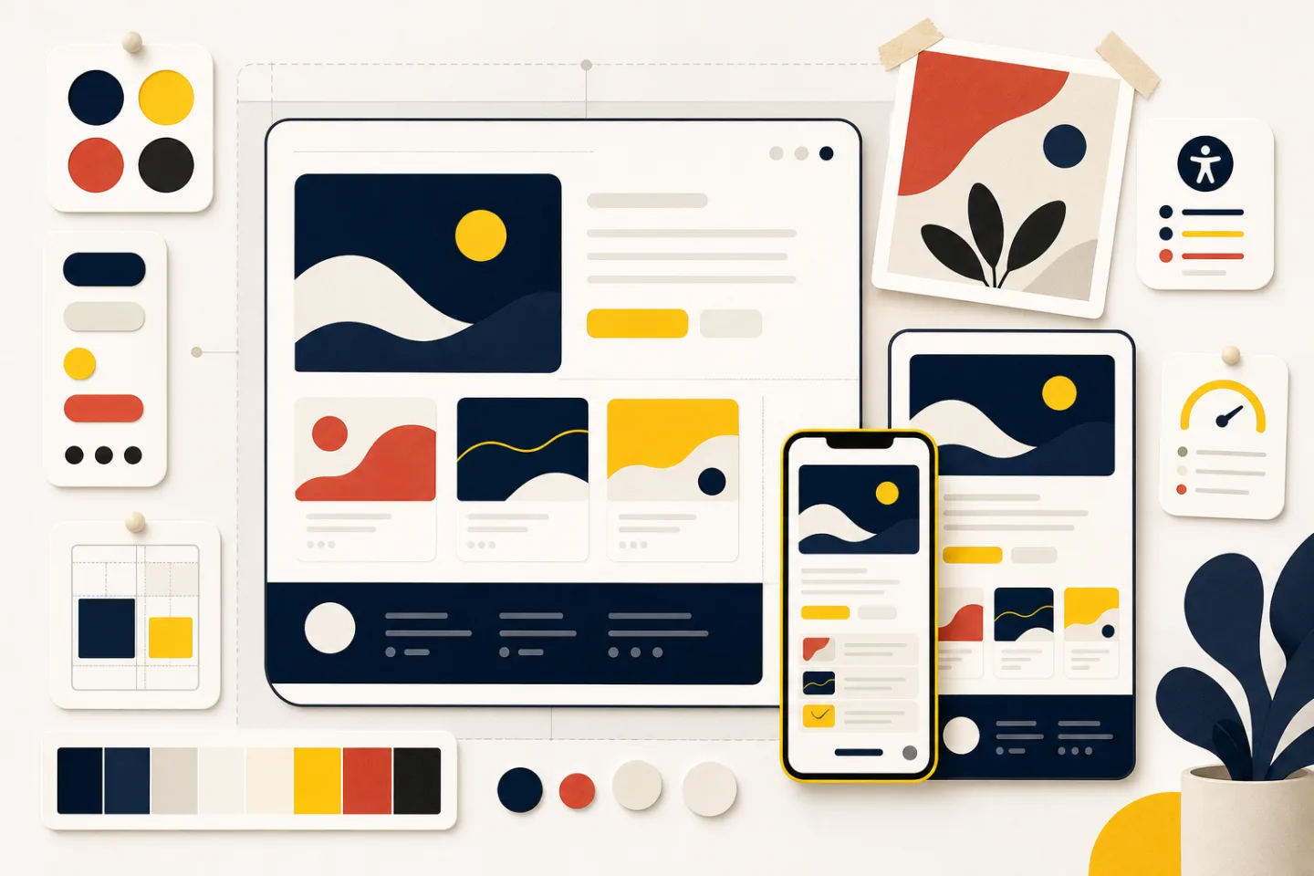
Web design shapes how a website looks, reads, and responds to the people using it. It brings together visual composition, content structure, interaction design, accessibility, and performance. A successful page helps visitors understand where they are, find what they need, and complete a task without unnecessary effort.
This guide explains the decisions behind effective web design and offers a practical process for making them. It applies to small informational sites, established service sites, and larger digital products.
What Web Design Includes
Web design begins with the purpose of the site. A portfolio must help people understand the work. A publication must make articles easy to discover and read. A service site must explain an offer and give visitors a clear path forward. The page layout, type, color, imagery, and controls should all support that purpose.
Design and development overlap, but they are not identical. Design defines the experience: the information order, visual language, responsive behavior, and interaction states. Development turns those decisions into a working site. On a small project, one person may handle both. On a larger project, clear documentation keeps the intended experience intact as work moves between roles.
Useful design work usually covers these areas:
- Content structure: deciding what belongs on each page and what should appear first.
- Visual hierarchy: using scale, weight, spacing, and contrast to show importance.
- Interaction: making links, buttons, forms, and navigation predictable.
- Responsive behavior: adapting the experience to different screens and input methods.
- Accessibility: removing barriers for people with varied abilities and preferences.
- Performance: limiting unnecessary code and media so the page remains efficient.
Start With Content and Tasks
Before choosing colors or arranging cards, identify the people the site serves and the tasks they are trying to complete. Write those tasks in plain language: compare services, read an article, review work samples, or understand a process. This keeps the design grounded in visitor needs instead of decoration.
Next, gather the content required for each task. Group related material, remove repetition, and give every page a clear focus. A heading should describe the section beneath it. Navigation labels should use familiar words rather than internal terminology. Calls to action should state what happens when a visitor uses them.
A rough content outline is often more useful than a polished mockup at this stage. It exposes missing explanations and awkward sequences before visual details make them expensive to change. If the page does not make sense as a simple outline, styling will not solve the underlying problem.
Build a Clear Visual Hierarchy
Hierarchy helps visitors decide where to look first. Begin with one dominant page heading, then use section headings and supporting text in a consistent order. Size is only one tool. Weight, color, position, and surrounding space can also signal importance.
Alignment gives a page an underlying structure. Text blocks, images, and controls feel related when their edges follow a deliberate grid. The grid can be symmetrical or uneven, but it should not feel accidental. Repeated spacing is equally important. A small set of spacing relationships creates rhythm and makes unrelated sections easier to distinguish.
White space is active design, not leftover room. It separates ideas, protects readable line lengths, and gives important elements enough presence. Filling every open area usually makes the page harder to scan.
Choose Type and Color for Reading
Body type should remain comfortable across screen sizes, with enough line spacing and contrast to support sustained reading. Limit type styles to those with a defined job, such as display headings, body copy, labels, and captions. Too many variations weaken the hierarchy they are meant to create.
Color should reinforce structure and identity. Use accent colors sparingly for meaningful emphasis and interactive elements. Never rely on color alone to communicate an error, selection, or status. Pair it with text, an icon, a pattern, or another visible cue.
Design Responsive Layouts From the Start
Responsive design is not a desktop layout squeezed onto a phone. It is a set of choices about how content should reflow when space changes. Start with the essential reading and task sequence, then add columns or supporting details when the available space allows them.
Flexible grids prevent layouts from depending on one screen width. Images and videos should fit their containers without distortion or overflow. Navigation may change form on a narrow screen, but its labels and destination order should remain familiar. Controls need enough space for touch as well as a clear focus state for keyboard use.
Test intermediate widths, not only a phone and a large monitor. Awkward wrapping and crowded controls often appear between familiar device sizes. Also test with longer headings, enlarged text, missing images, and slow media. A resilient layout should remain understandable when ideal conditions are absent.
Make Interaction Accessible and Predictable
People should be able to recognize what can be used and understand the result of each action. Links should look like links. Buttons should describe their action. Form labels should remain visible, and error messages should explain how to correct the problem. Hover effects can add feedback, but essential information must also be available without a pointer.
Keyboard access is a basic part of interaction design. The focus order should follow the visual and reading order, and the focused element should be easy to see. Headings should form a logical outline so assistive technology users can move through the page efficiently. Images that add meaning need useful text alternatives; decorative images should not create noise.
Motion can clarify a change, connect two interface states, or confirm an action. It should not delay access to content. Respect reduced-motion preferences and avoid animation that competes with reading. The best microinteraction is brief, purposeful, and understandable even when the effect is absent.
Protect Performance Through Design Decisions
Performance is partly a design responsibility because visual choices determine how much the browser must load and render. Large media, numerous type files, background video, and elaborate effects all have a cost. Ask whether each asset contributes enough meaning to justify that cost.
Prepare images for their intended display size and choose an efficient format suited to the image. Load offscreen media only when it is likely to be needed, while keeping important opening content available without delay. Prefer simple layout and animation techniques when they achieve the same communication goal as a heavier approach.
Performance also improves when the interface is consistent. Reusable patterns reduce duplicated code and make behavior easier to test. A component library should stay focused, however. Keeping unused variants and overlapping patterns can create as much clutter as an unstructured page.
Use Web Design Examples Critically
Web design examples are most useful when you study the reasoning behind them. Instead of copying a surface style, ask what the page emphasizes, how the navigation supports the content, and where the layout changes across screen sizes. Notice whether the visual character suits the subject and whether important actions remain clear.
Collaborate With Clear Decisions
Good handoffs explain behavior, not only appearance. Document content priority, responsive changes, interaction states, asset treatment, and accessibility expectations. Name the reason behind unusual choices so collaborators know what must be preserved and what can adapt.
Review the implementation early enough to correct structural problems. Check real content rather than placeholder text, and test the complete path a visitor follows. Designers and developers should resolve tradeoffs together, especially when a visual effect affects readability, accessibility, or performance.
Web Design as a Career
Web design roles vary widely. Some emphasize visual direction and interface composition, while others include research, content, prototyping, or front-end code. A useful portfolio shows not only finished screens but also the problem, constraints, decisions, and outcome of the work.
Web design salary discussions should account for role scope, experience, employment type, location, and the skills expected by the employer. A title alone does not provide enough context for a meaningful comparison. When evaluating a role, review the responsibilities and working conditions alongside compensation.
A Practical Review Checklist
Before considering a design complete, step away from the polished view and test the underlying experience:
- Can a first-time visitor explain the page purpose after a quick scan?
- Does each page have one clear heading and a logical content order?
- Are navigation labels, links, and buttons specific and predictable?
- Does the layout remain readable with enlarged text and narrow screens?
- Can every important action be completed with a keyboard?
- Do images, type, motion, and code justify their performance cost?
- Are empty, error, loading, and success states understandable?
- Does the visual language fit the subject instead of imitating an unrelated example?
Effective web design is a process of arranging priorities. Start with the visitor’s task, give the content a clear structure, and use visual choices to support that structure. Then test the page under varied conditions and refine what causes hesitation. The result should feel distinctive without making the reader work to understand it.